|
Getting your Trinity Audio player ready...
|
Power BI has become one of the most powerful tools for data visualization and business intelligence. In this project, I created a Blinkit Sales Dashboard to analyze sales, outlets, items, and customer ratings. This article will walk you through the complete process of building this dashboard, the DAX measures used, and how field parameters made it dynamic.
Project Overview
Objective: To analyze Blinkit’s sales performance using different perspectives such as outlet type, outlet size, location, fat content, and item types.
Dataset Includes:
- Sales
- Rating
- Item Details (Type, Fat Content, etc.)
- Outlet Details (Type, Size, Location, Establishment Year)
Tools Used:
- Power BI Desktop
- DAX (Data Analysis Expressions)
- Power Query (for data cleaning)
Key Features of the Dashboard
- KPI Cards: Displaying Total Sales, Average Sales, Number of Items, and Average Rating.
- Interactive Slicer (Field Parameter): Switch between metrics (Total Sales, Avg Sales, No. of Items, Avg Rating).
- Charts & Visuals:
- Fat Content analysis (Donut chart & Bar chart by outlet)
- Item Type contribution to total sales
- Sales trend by Outlet Establishment Year (Line chart)
- Sales distribution by Outlet Size and Location
- Performance comparison of different Outlet Types
Data Preparation
Before building visuals, I:
- Cleaned the dataset in Power Query.
- Ensured correct data types (Sales → Decimal, Rating → Decimal, Item ID → Text, Date → Date, etc.).
- Created a Date Table for time intelligence (if needed).
DAX Measures Used
To make the dashboard interactive and insightful, I created some simple yet powerful DAX measures:
— Total Sales
Total Sales = SUM(‘blinkit data'[Sales])
— Average Sales
Avg Sales = AVERAGE(‘blinkit data'[Sales])
— Average Rating
Avg Rating = AVERAGE(‘blinkit data'[Rating])
— Number of Items
No of Items = COUNTROWS(‘blinkit data’)
These measures were then used across cards, bar charts, and slicers to calculate business metrics.
More Project: Flipkart Sales Dashboard in Power BI
Using Field Parameters (Dynamic Metrics)
One of the highlights of this dashboard is the Field Parameter feature, which makes it easy to toggle between different KPIs.
Steps to create Field Parameter:
- Go to Modeling → New Parameter → Fields.
- Select the measures you want to toggle (Total Sales, Avg Sales, No of Items, Avg Rating).
- Name this parameter Metric.
- A slicer is automatically created, allowing users to switch between metrics.
This made the dashboard much more user-friendly and dynamic since viewers can analyze the same visuals from different KPI perspectives.
Insights from the Dashboard
From this analysis, we can see:
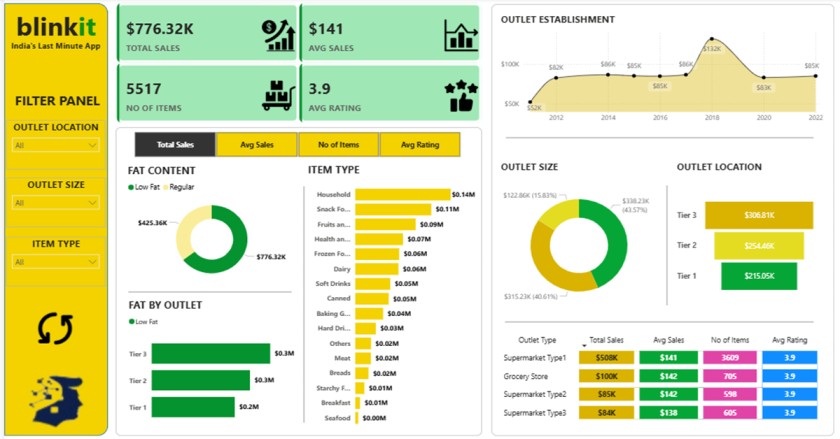
- Total Sales reached around $776K with 5,517 items sold.
- Fat Content: Regular fat items contributed more to sales than low-fat.
- Outlet Establishment Trend: Sales increased significantly after 2016 but showed fluctuations afterward.
- Outlet Size: Medium outlets contributed the highest share (43.57%).
- Outlet Location: Tier 3 outlets performed the best with $306K in sales.
- Outlet Type: Supermarket Type 1 was the leader with $508K in sales.
Challenges & Solutions
- Challenge: Handling multiple KPIs in one chart.
- Solution: Used Field Parameters for easy toggling.
- Challenge: Maintaining clean and structured data.
- Solution: Used Power Query transformations to ensure data consistency.
Conclusion
This Blinkit Sales Dashboard project demonstrates how Power BI + DAX can be used to analyze sales performance and outlet efficiency effectively. With the help of Field Parameters, the dashboard became interactive and provided multiple perspectives on the same dataset.
Such dashboards can help business leaders identify:
- Which outlet types perform best
- Customer preferences in fat content and item types
- Regional differences in demand
- Sales trends over time
If you are a beginner in Power BI, this project is a great way to practice creating KPIs, applying DAX formulas, and experimenting with field parameters. With more advanced datasets, you can expand this project by adding profit margin analysis, forecasting, customer segmentation, or even real-time data integration. By continuously improving your dashboards, you can transform raw data into actionable insights that businesses can rely on for decision-making.