|
Getting your Trinity Audio player ready...
|
A Sales Report is one of the most essential MIS (Management Information System) reports in any organization.
It gives business owners, managers, and analysts a clear picture of how their products or services are performing across regions, channels, and time periods.
In this tutorial, you’ll learn how to create a professional Sales Report in Excel, understand key metrics, and design a simple dashboard that can be reused every month.
What is a Sales Report?
A Sales Report summarizes your company’s sales activity for a specific period — daily, weekly, monthly, or yearly.
It helps management track revenue, spot trends, and make data-driven decisions.
Common questions a Sales Report answers:
- How much total sales did we make this month?
- Which products sold the most?
- Which region or channel performed better?
- Who are our top customers?
Sample Sales Data
Before creating a report, make sure your data has these columns:
| Date | Invoice No | Customer Name | Region | Product | Sales Channel | Quantity | Unit Price | Total Sale |
|---|---|---|---|---|---|---|---|---|
| 2025-01-05 | INV123456 | ABC Retail Pvt Ltd | North | Shampoo | Retail | 25 | 120 | 3000 |
| 2025-01-07 | INV789654 | Star Distributors | East | Soap | Distributor | 50 | 60 | 3000 |
| 2025-01-09 | INV456123 | Fresh Mart | South | Detergent | Online | 10 | 250 | 2500 |
👉 Note: Download Sample Data below
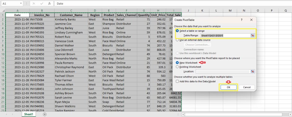
Step 1: Insert a Pivot Table
- Select the entire sales data range.
- Go to Insert → PivotTable.
- Choose New Worksheet and click OK.
Step 2: Create a Region vs Product Report
- In the PivotTable Fields panel:
- Drag Region → Rows
- Drag Product → Columns
- Drag Total Sale → Values
- Format “Sum of Total Sale” as currency.
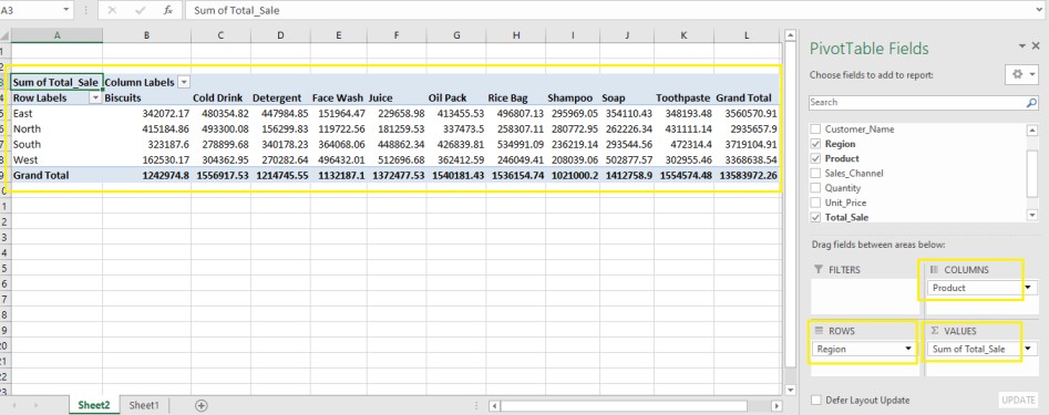
You’ll now have a cross-tab report showing total sales by region and product.
Step 3: Add a Monthly Sales Trend
- Create another PivotTable in a new sheet.
- Drag Date → Rows, then right-click → Group → Months.
- Drag Total Sale → Values.
- Insert a Line Chart (Insert → Charts → Line).
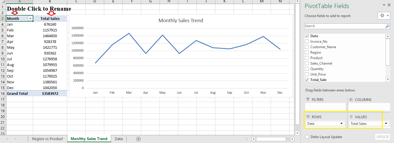
Now you can visualize how your sales trend over time.
Also Read: Charts in Excel
Step 4: Create a Product-Wise Sales Summary
- Drag Product → Rows
- Drag Total Sale → Values
- Sort values Descending to find top performers.
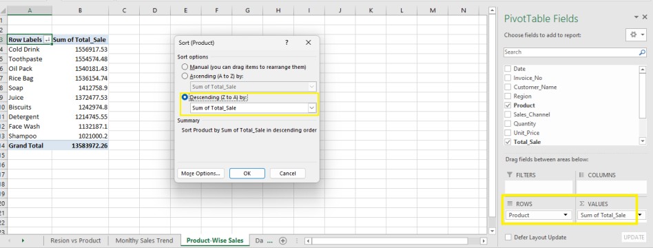
This report shows which products generate the most revenue.
Step 5: Region-Wise Sales Performance
To compare performance by region:
- Drag Region → Rows
- Drag Total Sale → Values
- Insert a Column Chart to visualize it.
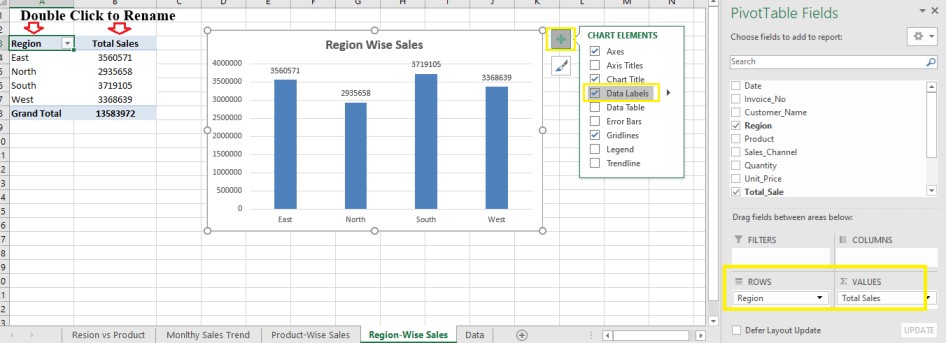
This helps you see which region contributes the most to your total sales.
Step 6: Build a Simple Sales Dashboard
Create a clean one-page dashboard using:
- Card / KPI Box: Total Sales (use
=SUM(Total_Sale)) - Column Chart: Region-wise Sales
- Pie Chart: Sales by Channel
- Table: Top 10 Customers
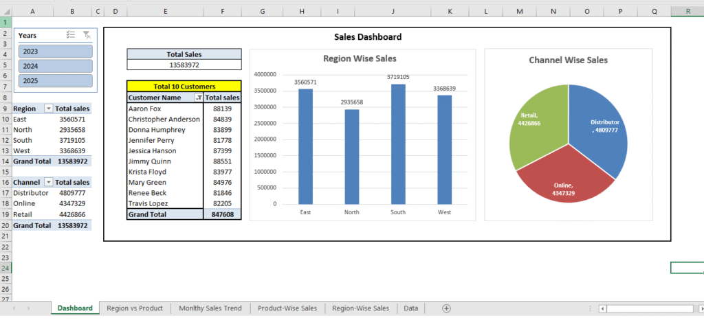
Use colors, slicers, and filters to make it interactive and visually appealing.
Step 7: Real-Life Use Cases
| Industry | Example Use | Key KPIs |
|---|---|---|
| FMCG | Sales tracking by distributor & SKU | Sales Volume, Revenue Growth |
| Garments | Sales by store and design | Sell-Through Rate, Inventory Turnover |
| E-Commerce | Orders by platform & category | Conversion Rate, Average Order Value |
| Government / SWS | Application fees by district | Revenue by Service or Department |
Step 8: Insights You Can Derive
- Identify top 10 products driving 80% of revenue.
- Compare region-wise performance to spot low-performing zones.
- Track monthly trends for seasonality.
- Evaluate sales channel efficiency (Retail vs Online vs Distributor).
Conclusion
A well-designed Sales Report gives instant visibility into your business performance and helps decision-makers identify what’s working — and what’s not. Whether you’re managing an FMCG distribution network, a garment showroom, or a government service portal, sales reporting is the foundation of effective business monitoring.
Start simple with Excel PivotTables to build clarity and confidence in your data. As you gain experience, move towards dashboards that combine charts, KPIs, and filters for quick insights.
Remember, the goal of an MIS report is not just to present numbers, but to tell a story —
Which products drive revenue?
Which region performs best?
Are sales improving month by month?
When your report answers these questions clearly, it becomes a true decision-making tool rather than just another spreadsheet.
So, start today — build your first Sales Report, customize it for your organization, and make reporting a part of your everyday business intelligence routine.
Next Tutorial: Purchase Report in Excel