|
Getting your Trinity Audio player ready...
|
Learn how to use charts in Excel with real-life examples. Understand when to use each chart type in simple words. Perfect guide for beginners and analysts.
What Are Charts in Excel?
Charts in Excel help visualize data. Instead of looking at plain numbers, charts let you see trends, comparisons, and patterns clearly.
For example:
Instead of saying “Sales in Q1 were 10,000, Q2 15,000, Q3 12,000, Q4 18,000”, a Column Chart shows this data in a bar format so you instantly see which quarter did best.
Step-by-Step: How to Insert a Chart in Excel
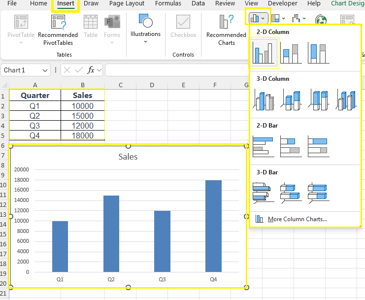
Step 1: Select Your Data
Start by selecting the data that you want to visualize. For example:
| Quarter | Sales |
|---|---|
| Q1 | 10000 |
| Q2 | 15000 |
| Q3 | 12000 |
| Q4 | 18000 |
Select both Quarter and Sales columns.
Step 2: Go to the “Insert” Tab
Click on the Insert tab from the Excel ribbon at the top.
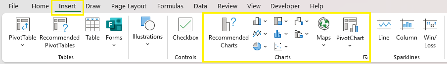
Step 3: Choose a Chart Type
In the “Charts” section, choose your chart:
- Column or Bar Chart: Best for comparing categories
- Line Chart: Shows trends over time
- Pie Chart: Great for showing proportions or % share
- Combo Chart: When you want to compare 2 different types of data
- Scatter Chart: For scientific or correlation data
👉 Example: For our sales data, choose Insert Column Chart > Clustered Column
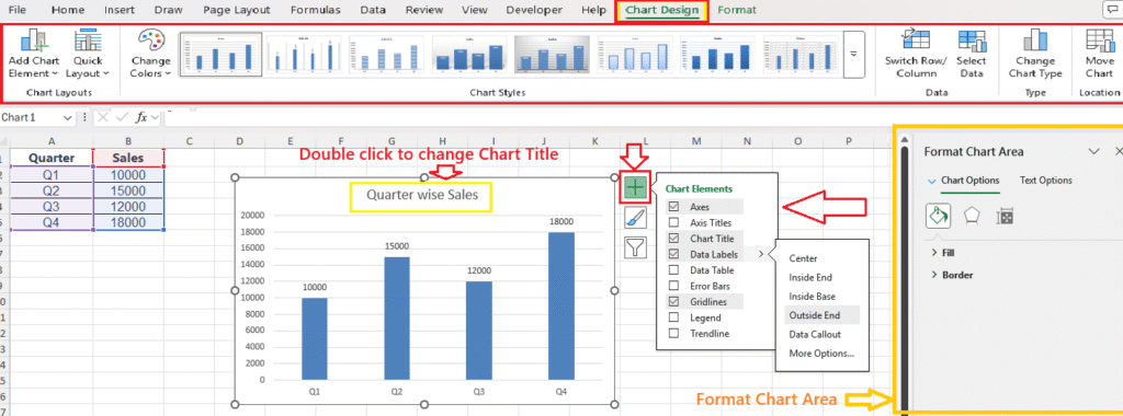
Step 4: Customize Your Chart
Once the chart appears, you can:
- Change the chart title – Double Click to change
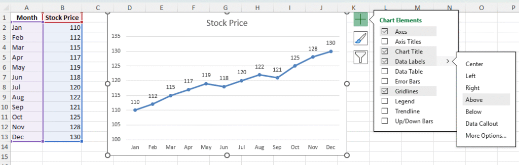
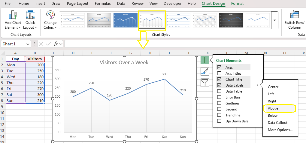
- Add data labels (click the “+” icon beside the chart)
- Change colors or styles
- Move or resize it easily by dragging
1. Column Chart
Best for: Comparing values across categories.
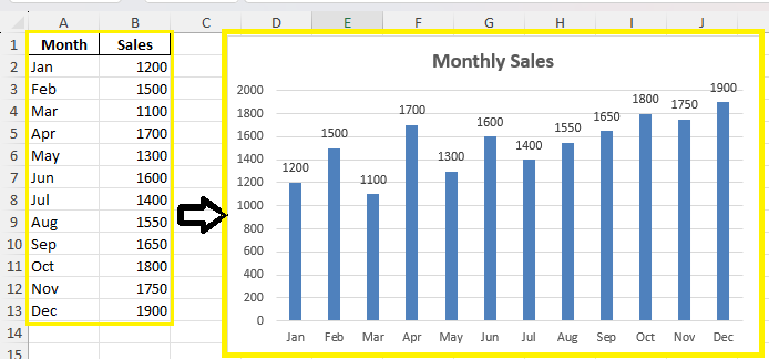
Example 1: Monthly Sales Comparison
- Compare sales data from Jan to Dec.
- Summary: This chart shows how sales figures vary each month, helping you identify high and low-performing periods.
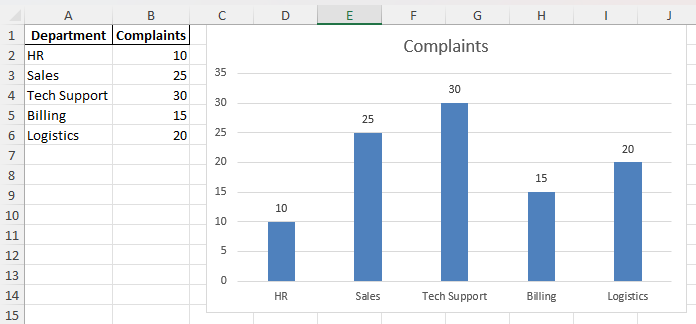
Example 2: Number of Complaints per Department
- HR, Sales, Tech Support, etc.
- Summary: Helps visualize which department receives the most customer complaints for better resource allocation.
2. Line Chart
Best for: Showing trends over time.
Example 1: Stock Prices Over 12 Months
- Plot closing prices per month.
- Summary: Tracks how stock prices change over the year, making it easier to spot trends.
Example 2: Website Visitors Over a Week
- Days on X-axis, number of visits on Y-axis.
- Summary: Shows daily traffic to analyze peak website usage days.
Also Read: Pivot Table in Excel
3. Pie Chart
Best for: Showing proportions or percentage share.
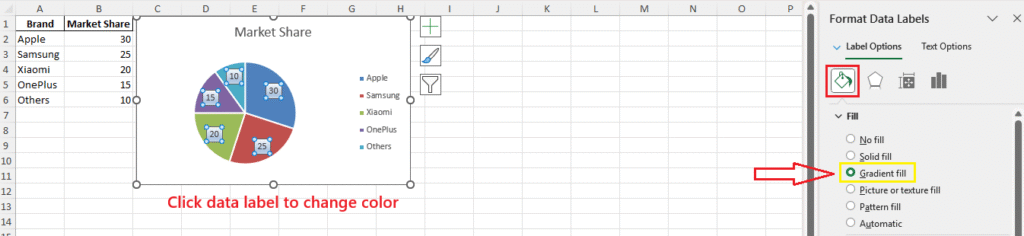
Example 1: Market Share of Smartphone Brands
- Apple, Samsung, Xiaomi, etc.
- Summary: Quickly understand how different brands divide the smartphone market.
Example 2: Expense Distribution
- Rent, Salary, Travel, Internet
- Summary: Helps you see which expense category takes up the most budget.
- Practice this
4. Bar Chart
Best for: Comparing large categories horizontally.
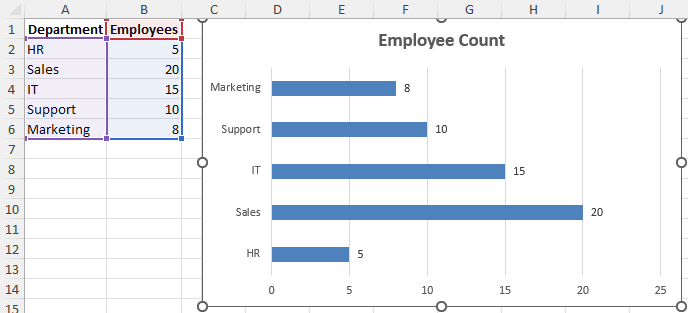
Example 1: Employee Count by Department
- HR, Sales, IT, etc.
- Summary: Makes it easy to compare staffing across departments.
Example 2: Revenue by Region
- East, West, North, South
- Summary: Visualizes which region contributes most to total revenue.
- Practice this
5. Area Chart
Best for: Displaying cumulative data trends over time.
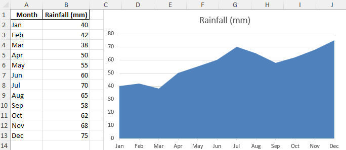
Example 1: Cumulative Rainfall Over Months
- Month vs Rainfall
- Summary: Tracks how rainfall accumulates each month throughout the year.
Example 2: Website Traffic Growth
- Compare organic vs paid traffic over time.
- Summary: Shows which traffic source is growing faster over time.
- Practice this
6. Scatter Chart
Best for: Showing relationship/correlation between two sets of data.
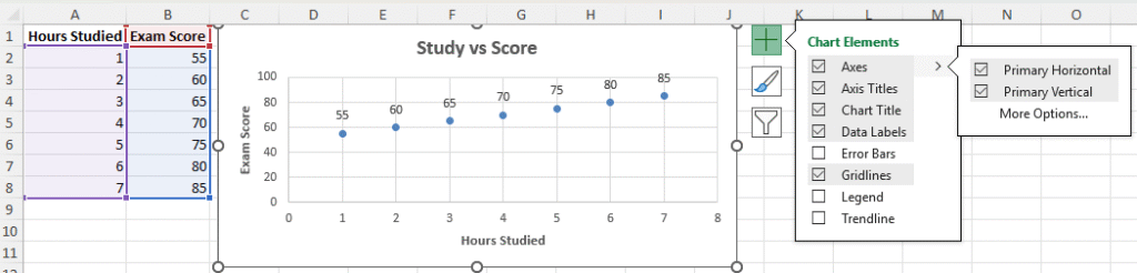
Example 1: Hours Studied vs Exam Score
- To see if study time impacts results.
- Summary: Shows correlation between study hours and exam performance.
Example 2: Ad Spend vs Conversions
- Analyze effectiveness of marketing.
- Summary: Helps marketers see if higher spending leads to better results.
- Practice this
7. Combo Chart
Best for: Plotting two types of data on one chart.
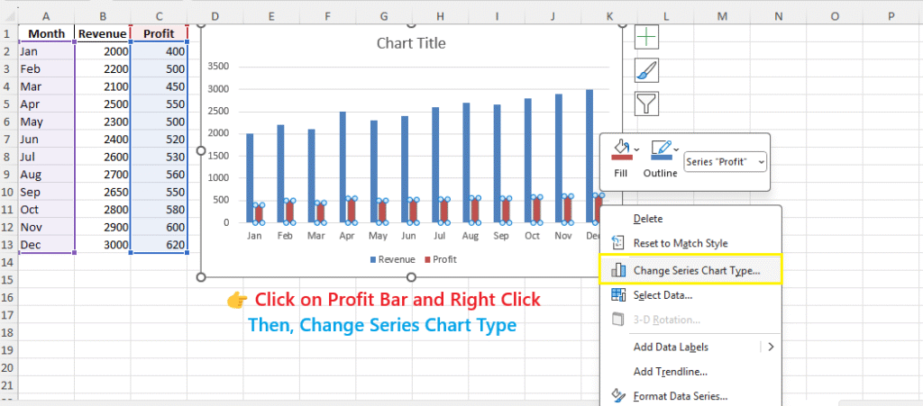
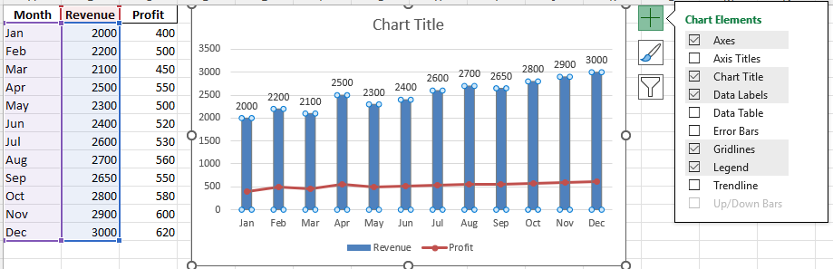
Example 1: Revenue and Profit
- Column for revenue, line for profit.
- Summary: Displays two related metrics in a single visual for easy comparison.
Step 1:
Step 2:
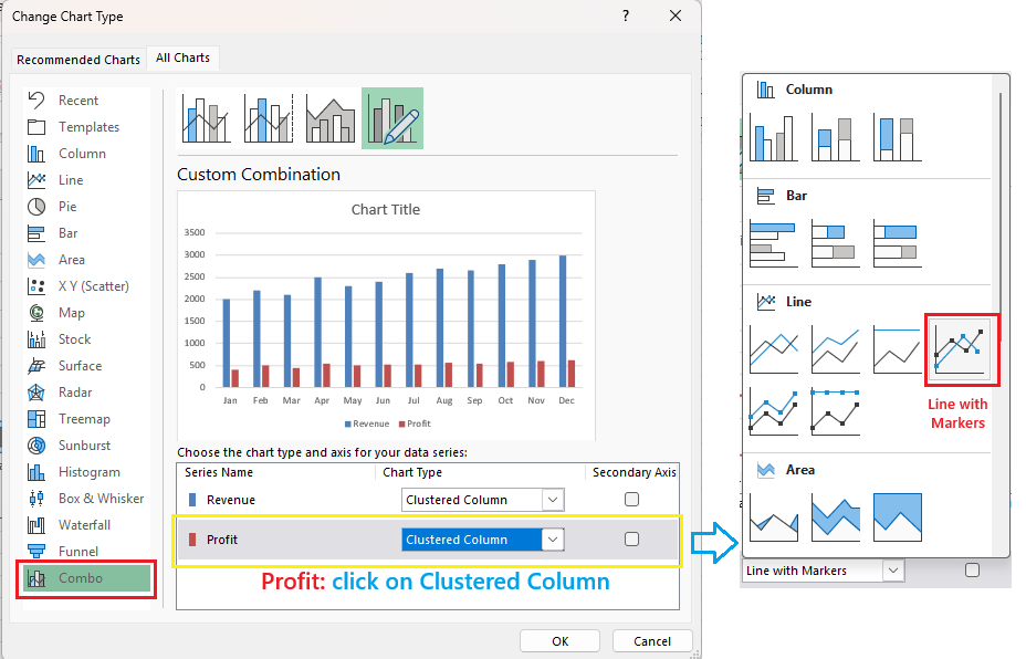
Final Output:
Example 2: Budget vs Actual Expenses
- Columns and lines to show comparison.
- Summary: Quickly highlights differences between planned and actual spending.
- Practice This
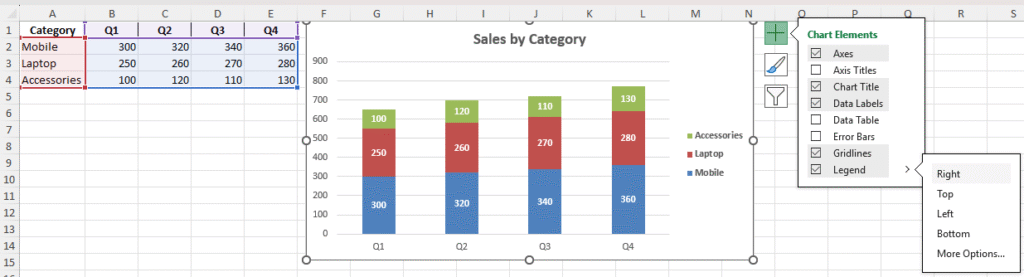
8. Stacked Column Chart
Best for: Comparing parts of a whole over different categories.
Example 1: Sales by Product Category by Quarter
- Mobile, Laptop, Accessories per quarter.
- Summary: Breaks down sales data to show category-wise contribution across quarters.
Example 2: Population Distribution by Age Groups
- Children, Adults, Seniors in multiple states.
- Summary: Compares how different age groups are spread across regions.
- Practice This
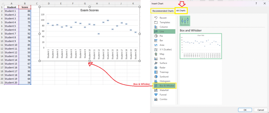
9. Box and Whisker Plot
Best for: Statistical summary (min, max, median, outliers).
Example 1: Exam Scores Analysis
- Identify outliers and medians for performance.
- Summary: Provides a full statistical overview of students’ performance, including extremes.
Example 2: Product Ratings on E-commerce Site
- Display how varied customer ratings are.
- Summary: Shows spread and central tendency of product reviews.
- Practice This
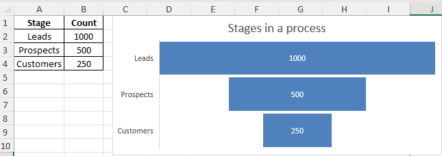
10. Funnel Chart
Best for: Showing stages in a process.
Example 1: Sales Funnel
- Leads ➝ Prospects ➝ Customers
- Summary: Visualizes how leads convert into customers at each stage of the funnel.
Example 2: Job Application Funnel
- Applied ➝ Interviewed ➝ Offered ➝ Hired
- Summary: Helps HR teams analyze recruitment effectiveness across stages.
- Practice This
Summary
| Chart Type | Best Use |
|---|---|
| Column | Category comparison |
| Line | Time-based trends |
| Pie | Percentage breakdown |
| Bar | Horizontal category comparison |
| Area | Cumulative trend |
| Scatter | Relationship between variables |
| Combo | Two different types of data |
| Stacked Column | Part-to-whole across categories |
| Box & Whisker | Statistical distribution |
| Funnel | Sequential stages |
Download Practice File
📥 Download Excel FileFinal Thoughts
Choosing the right chart depends on what story your data is telling. A column chart is great for simple comparisons, while a scatter plot is ideal for correlation analysis. Use the examples above and try applying them to your own data.
You don’t need to memorize everything—just understand when to use which chart, and Excel will do the rest.
FAQs – Charts in Excel
What is the best chart for time-based data?
Line chart is ideal for trends over time (like monthly or weekly).
When should I use combo charts?
When you need to compare two datasets with different units/scales.
How do I add data labels?
Click on chart → Chart Elements (+) → Data Labels
Can I use charts in dashboards?
Absolutely! Charts are a core part of interactive dashboards.
What’s Next?
In the next post, we’ll learn about the XLOOKUP in Excel